How I Actually Design a Piece
Ten years in, people ask me a lot how I actually land on a design — why a piece looks the way it does, why one element gets space and another doesn't. So I picked four pieces, all different disciplines, and wrote out the actual thinking behind them. Not the polished version — just how it happened.
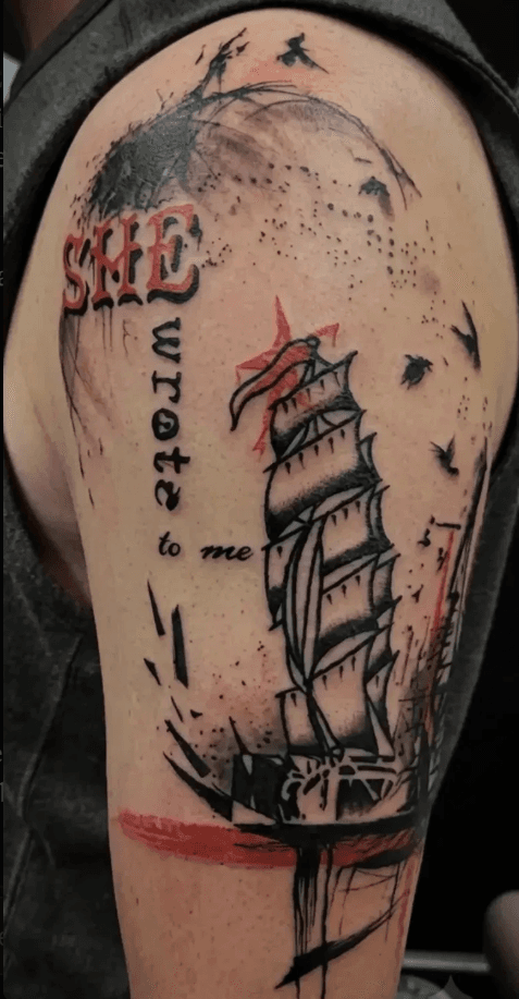
Ship / "She Wrote to Me"
Honestly, I just thought it would work. This started as a flash piece — I was listening to sea shanties while drawing and landed on the ship as the focal point. The birds, the sailing-at-night feeling, all of that came from the same place. I knew the ship had to anchor it.
The lettering came in because I needed something to fill space with a strong silhouette — not too busy. Text felt right, so I played with it until it landed. I probably went through 50+ font combinations before I found the one that actually worked with the piece instead of against it.
This was one of the first ten designs I did in Trad Polka Fusion. I was leaning hard on trash polka references at the time — pulling elements, composition, and adapting them into my own version of it.
The part that actually surprised me was the negative-space ship hull, and how the splatter and chaos around it came together. Those two elements are what tie the whole thing together. Nothing in this piece is there by accident — whether it's serving the look or the flow, everything has a place, and everything's in its place.
Start a consultNew flash drops before anyone else sees them — get on the list.
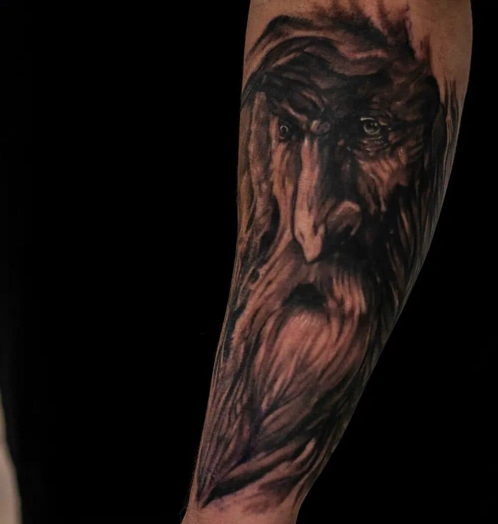
Wood-spirit portrait, forearm
The client wanted this done in black & grey instead of full color, and I agreed. I usually lean toward color, but some pieces are just stronger without it. With B&G, less is often more — things read cleaner, and the piece gets room to breathe.
This was almost five years ago, and I didn't have a ton of B&G experience at the time. Honestly, I surprised myself with this one. Looking back, there are a few things I'd do differently — but the beard and the eyes are what really brought it together for me.
This was one of the last sessions finishing up that client's LOTR sleeve.
Every tattoo needs to work with the body part it's going on, not against it — if the design doesn't sit right, it fights the person's natural flow forever instead of complementing it. That's not optional. That's the job.
Start a consult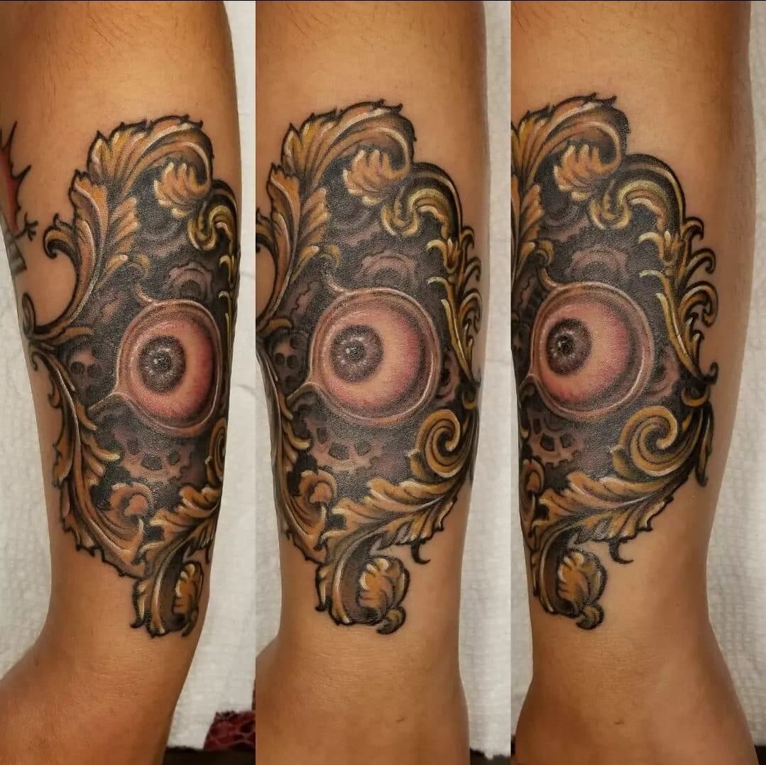
Filigree eye piece
Honestly, I wanted to push myself. That's the only way you grow as an artist. I was upfront with my client about that going in — and she trusted me. It ended up being one of her favorite pieces she's gotten.
I planned the whole thing out beforehand — didn't want to leave much to chance. Once the stencil was on, I adjusted a little, but very little.
The image is actually from her favorite book series. It meant a lot to her to get that specific piece — and it meant a lot to me to put my own spin on it.
Start a consultWant more of this? New pieces and the thinking behind them, straight to your inbox.
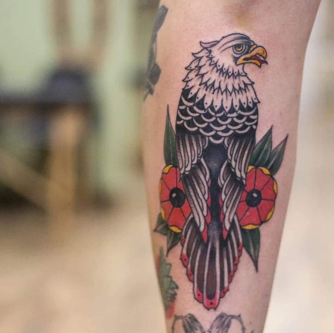
Eagle & poppies
Traditional doesn't leave a lot of room to reinvent the application — bold lines and solid saturation are non-negotiable, that's what makes it read as traditional. The individuality comes through in the subject matter, the imagery each artist gravitates toward over time. Traditional has to look a certain way. The subjects are endless.
This one — the eagle, the poppies — all came from the client. My job was just making it work.
I wouldn't change anything on this piece. I had a lot of help from Dan Cameron at Ambassador Tattoo Co, who I worked with for a couple years. He taught me a huge amount about composition and the general rules of traditional work, and I owe a lot of my recent growth to that. There's a few people I owe a real thank-you to — but that's a story for another time.
Start a consultFour pieces, four disciplines, one rule that holds across all of them: everything has a place, and everything's in its place.
New flash. New thinking. Occasional emails, no spam.